The right color choices in wall art can turn an ordinary room into a space that feels personal, inviting, and full of character. Art does far more than fill an empty wall. It becomes a centerpiece that influences mood and shifts how spacious or intimate a room feels. A thoughtfully selected piece can bring harmony to your entire interior.
To create a cohesive look, your artwork and wall colors need to work together with intention. Art functions as both a form of expression and a design tool that elevates your home’s visual appeal. Studies show that viewing artwork we genuinely enjoy triggers endorphins that support emotional well-being. This guide explores how to choose pieces that either blend seamlessly with your current palette or introduce bold contrasts for added interest.
These practical ideas will help you pick wall art color schemes that transform your rooms in a meaningful way, no matter your taste or budget.
How Art Affects the Feel of a Room
Colors tell stories without words and touch our emotions in ways that language can’t. Wall art uses these colors as an emotional language that shapes how we feel in any room.
The emotional power of color in art
A study by University College London shows how colors speak to our emotions without needing words. This explains why we feel instant mood changes when looking at certain artworks. Every color carries its own emotional message: red sparks passion and urgency, blue helps us reflect and feel calm, while green links us to nature’s harmony and growth.
Research shows that warm colors (red, orange, yellow) create strong emotional responses. These bright shades get people energized and trigger gut reactions. They work great in social spaces where you want people talking and moving around. Cool colors like blues, greens, and purples paint a quieter emotional picture. These shades work best in spaces meant for relaxation.
The science backs this up. Our brains release feel-good chemicals like dopamine and serotonin when we see art that moves us. This reaction in our brains explains why the right wall art colors can completely change how we experience our rooms.
Art as a mood-setter in interior design
Art sets the emotional tone of a room before anyone says a word. Big abstract pieces with rich colors energize the space. Soft landscapes with gentle colors create a peaceful feeling. Designers know this power well. They pick pieces that match both their client’s personality and the room’s intended mood.
Each room needs its own emotional tone through art. Family rooms come alive with bright, dynamic pieces that spark joy and movement. Bedrooms need art that helps you unwind and reflect. Dining rooms shine with warm-colored art that makes people hungry and chatty—think earth tones, clay reds, and deep wine colors.
Smart art placement with specific color schemes changes more than just walls. It transforms how the whole space feels. Cool-toned art helps ease you into morning in east-facing bedrooms. Warm colors in western rooms make evenings more relaxing. This thoughtful approach to wall art creates spaces that support your daily routines naturally.
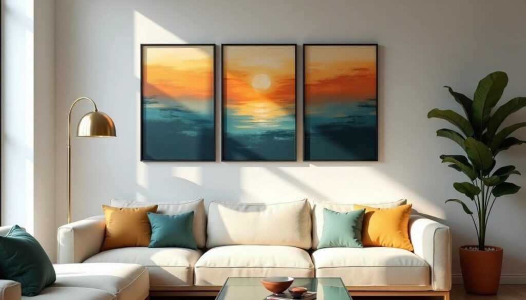
Using Color Theory to Guide Art Selection
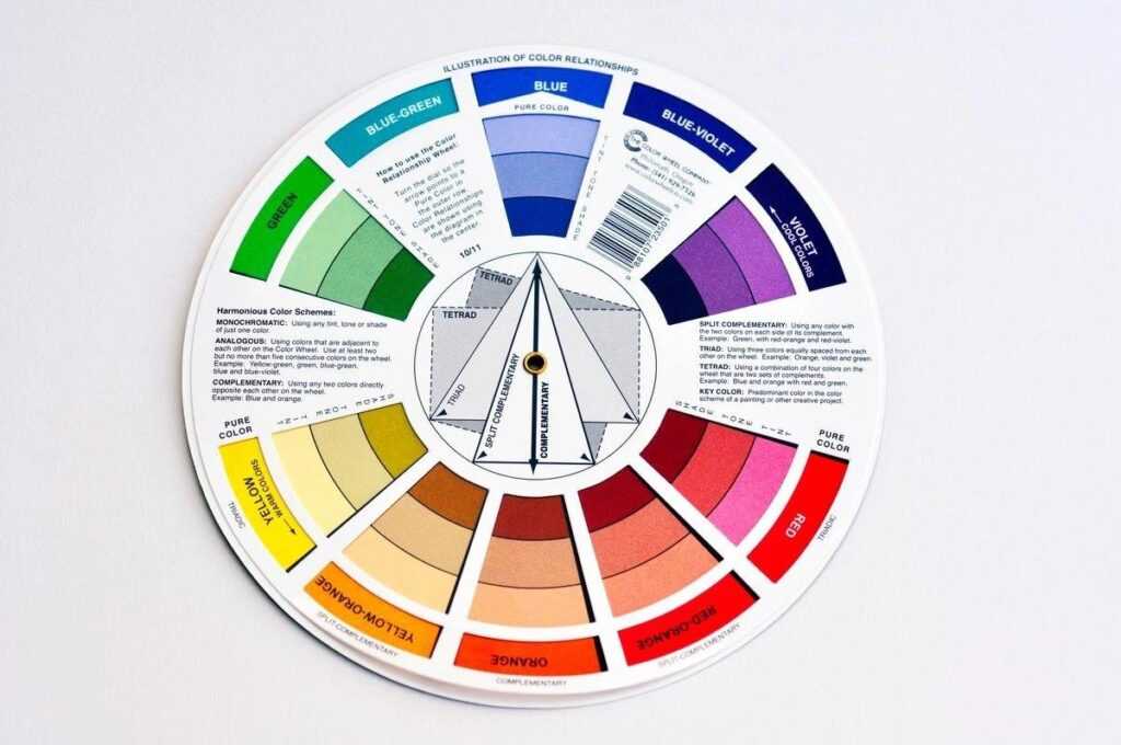
Image Source: Homes and Gardens
Color theory gives you a practical way to pick wall art that boosts your space. You can make confident and intentional choices by applying these principles instead of guessing what works.
Understanding warm vs. cool tones
The color wheel splits into warm tones such as reds, oranges, and yellows and cool tones such as blues, greens, and purples. Warm colors create a sense of coziness and intimacy. They tend to visually advance, which helps larger rooms feel more snug. Cool colors bring tranquility and tend to visually recede, which makes smaller spaces feel more open.
Your room’s purpose should guide your color choices. Living and dining rooms benefit from warm toned art that encourages conversation and energy. Cool toned pieces are ideal for bedrooms and offices where you want to relax or maintain focus. Many homeowners choose paintings with blue to add depth and calm to these quieter spaces, a style often highlighted by the thoughtful collections offered by Art by Maudsch.
How to use contrast and harmony
Complementary colors—those opposite each other on the color wheel (blue/orange, red/green, yellow/purple)—create dynamic energy when used together. These contrasting combinations can revolutionize a room instantly.
The wheel’s adjacent colors create sophisticated harmony through analogous color schemes. This approach feels cohesive without overwhelming the space.
The 60-30-10 rule provides a simple formula: 60% dominant color, 30% secondary color, and 10% accent color. This balanced mix creates visual rhythm that doesn’t compete for attention.
Color saturation and its visual impact
Saturation shows a color’s intensity or purity. Vibrant colors grab attention quickly, while muted colors add sophistication and subtlety.
Muted colors play a vital role in supporting and boosting bright colors within artwork. A thoughtful mix of high and low saturation adds depth and visual interest. Light affects how we see saturation. Natural daylight makes rich colors pop, while artificial lighting might reduce their effect.
Choosing Art That Works with Your Decor
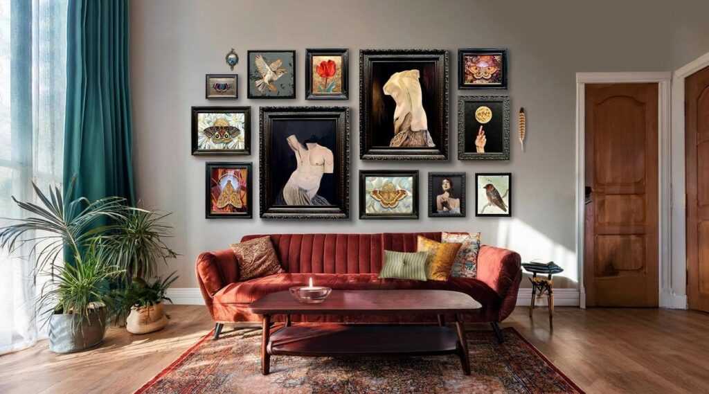
Image Source: The Copper Wolf
Choosing artwork that goes together with your existing decor combines artistry and practical thinking. Your personal taste plays a role, but several tested strategies will help you make choices that raise your space instead of fighting with it.
Working with existing wall color schemes
Your room’s current esthetic and dominant colors in furniture, curtains, and decorative items should guide your choices. You don’t need exact matches – look for artwork with hints of these colors to create a subtle, unified look. Your living room with blues and greens will feel more connected when artwork shares these tones.
A clever way to tie everything together is to pick specific colors from your artwork and echo them in nearby décor through accent pieces like throw pillows, area rugs, or ceramics. Neutral walls give you great flexibility and let you switch artwork seasonally without changing your entire color scheme.
Blending vs. contrasting art styles
Your home gains depth and character when you mix different art styles. Design professionals suggest that studying successful designers who blend scale and texture builds confidence in mixing styles. A clear foundation should guide your decisions when blending styles. To cite an instance, see how a modern living room might feature botanical or abstract artwork while keeping its core esthetic.
You can create unity in a variety of styles by keeping frames consistent throughout a space. Adding different textures brings another layer—try combining abstract acrylics with carved wooden pieces or a woven tapestry to create visual interest.
Framing and mounting considerations
The right frame puts art in context—it should either contrast or complement rather than just match. Float mounting, shadow-boxing, or raw edges each create a different visual impact. Basic frames can diminish good work, so bare edges might work better if perfect framing isn’t in your budget yet.
Standard guidelines suggest hanging artwork with its center 57-60 inches from the floor. Art placed above furniture needs 6-12 inches between the furniture’s top and the artwork’s bottom edge. Semi-permanent hanging strips are a great way to get the placement right before making final decisions.
Scaling art to fit your space
Visual balance comes from proper sizing. Empty walls look best when artwork takes up about 60-75% of available space. Art hung above sofas or beds should span 50-75% of the furniture’s width.
Art that’s too small ranks among the most common decorating mistakes—undersized pieces make walls look unfinished and spaces feel incomplete. Large pieces can overwhelm small rooms. The safer choice is usually going slightly bigger rather than smaller.
Art shapes affect how we perceive space:
- Vertical pieces make ceilings look taller
- Horizontal artwork makes smaller rooms feel wider
- Large statement pieces become bold focal points
Your artwork should reflect who you are. Well-scaled and thoughtfully placed pieces do more than fill blank walls—they create movement and balance that adds to your home’s overall harmony.
Great Options for Creative and Relaxing Art Projects
DIY wall art gives you full control over your color choices. You can match your existing palettes with precision and bring more personal meaning into your decor. A simple and enjoyable way to begin is by exploring creative kits such as https://numberartist.com/collections/paint-by-numbers, which guide you through each step and help you create artwork that feels polished and expressive. Many homeowners appreciate the relaxing process offered by Number Artist and enjoy displaying pieces they created themselves.
Hand painted canvases are another strong option. Choose acrylic paints that complement the colors already present in your room. Artistic experience is not required to build beautiful abstract designs. All you need is a palette that works well with your space.
Your creative trip can include:
- Mandala drawing — These circular patterns help reduce negative emotions and use colors that bring tranquility.
- Nature-inspired collages — Add pressed flowers or botanical prints on matching backgrounds to create a peaceful look.
- Woven wall hangings — These pieces add texture while keeping neutral color schemes.
- Watercolor flow painting — This fluid medium lets you relax, quiet your mind, and reach a meditative state.
The benefits go beyond just decoration. Creating art mindfully releases endorphins and boosts your wellbeing. When you display your work, you feel more connected to your space.
Zen-inspired wall art can bring peace to your home. Black and white nature scenes, minimalist designs, or mandalas help create spaces that encourage mindfulness and serenity. Your color choices can turn any room into a personal sanctuary that shows both your style priorities and emotional needs.
Real-Life Applications and Styling Tips
Your home offers countless opportunities to express your style through thoughtful wall art color schemes. With the right choices, everyday rooms can feel more personal and inviting. Consider these ideas when selecting artwork for key spaces in your home:
- Living room
Gallery walls work especially well in living rooms because these spaces usually offer the most open wall area. Mixing posters of different sizes creates a dynamic display that reflects your personality. Large prints can also anchor bigger rooms with a clean, focused look. Gallery walls continue to evolve in 2025 and are now seen in staircases and cozy corner nooks. - Bedroom
Bedrooms benefit from art that encourages relaxation. Soft blues with lilac undertones, such as Benjamin Moore’s Jet Stream, create a peaceful retreat. Deep gray-blue shades like Rain Cloud bring a calm sophistication that blends traditional and modern styles. Warm brown tones like Grounded are becoming popular as they replace cooler grays while adding an elegant, restful feel. - Dining room
Dining areas shine when they feature bold statement pieces. Abstract artwork with strong color contrasts can spark conversation and elevate the room’s atmosphere. Sconces placed on either side of a main piece add polish and drama. Tall display cabinets can function as decorative focal points when styled with intention. - Home office
Wall art in a home office can influence productivity and mindset. Motivational prints with uplifting messages help you stay focused on your goals. Typography-based designs look stylish and encouraging. Choose pieces that energize you, whether you prefer modern simplicity or bright, playful pop art.
A Final Touch of Insight
Thoughtful color choices in wall art give your rooms a clear sense of identity. The right combinations support comfort, spark creativity, and shape the way each space feels as you move through it. You have seen how color theory, smart placement, and mindful selection work together to create a home that feels balanced and expressive.
Your interiors grow richer when the artwork reflects both your visual taste and the atmosphere you want to nurture. Warm colors encourage lively gatherings, cool tones support rest and focus, and creative projects add a layer of personal meaning that makes your home feel truly lived in.
Small adjustments in color, scale, and style leave a lasting impact on the overall harmony of your home. When art and color schemes work in unity, your rooms feel complete and thoughtfully shaped. With these principles in mind, you can continue refining your interiors with clarity and confidence, building spaces that support your lifestyle and express who you are with quiet strength.
 Reginae Daviester has been a key contributor to the success of Residence Resale Tactics, leveraging her creativity and dedication to help build a platform that serves as a comprehensive resource for real estate professionals. Her role as a helper involves crafting innovative ideas and supporting content development, ensuring the platform remains engaging and valuable for its audience. Reginae’s passion for real estate is reflected in her commitment to delivering high-quality insights that empower users to navigate the market effectively.
Her diverse skill set and willingness to take on new challenges have been vital to the project’s growth, enabling Residence Resale Tactics to expand its offerings and maintain its status as a leading resource. Reginae's enthusiasm and forward-thinking approach continue to inspire the team, contributing significantly to the platform's ongoing evolution and impact in the real estate community.
Reginae Daviester has been a key contributor to the success of Residence Resale Tactics, leveraging her creativity and dedication to help build a platform that serves as a comprehensive resource for real estate professionals. Her role as a helper involves crafting innovative ideas and supporting content development, ensuring the platform remains engaging and valuable for its audience. Reginae’s passion for real estate is reflected in her commitment to delivering high-quality insights that empower users to navigate the market effectively.
Her diverse skill set and willingness to take on new challenges have been vital to the project’s growth, enabling Residence Resale Tactics to expand its offerings and maintain its status as a leading resource. Reginae's enthusiasm and forward-thinking approach continue to inspire the team, contributing significantly to the platform's ongoing evolution and impact in the real estate community.